Loading collection...
🔤
Typography Vocabulary
The art and technique of arranging type
10 words
All 10 Words
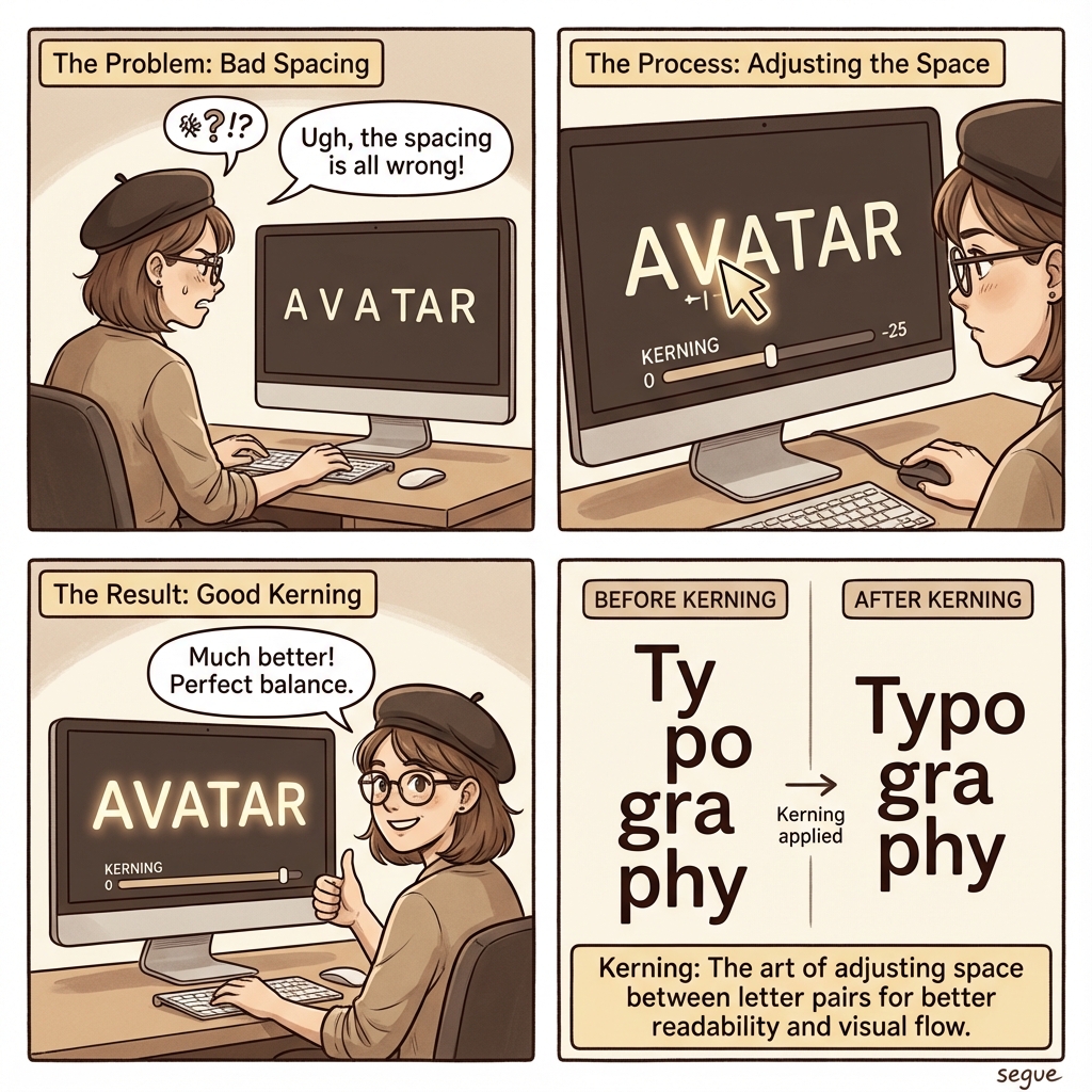
kerning
/ˈkɜːrnɪŋ/adjusting the space between individual letter pairs
“Poor kerning made the logo look unprofessional.”
leading
/ˈɫidɪŋ/the vertical space between lines of text
“Generous leading improved readability of the body text.”
tracking
/ˈtɹækɪŋ/uniform adjustment of spacing across a range of characters
“Loose tracking gave the headline an elegant feel.”
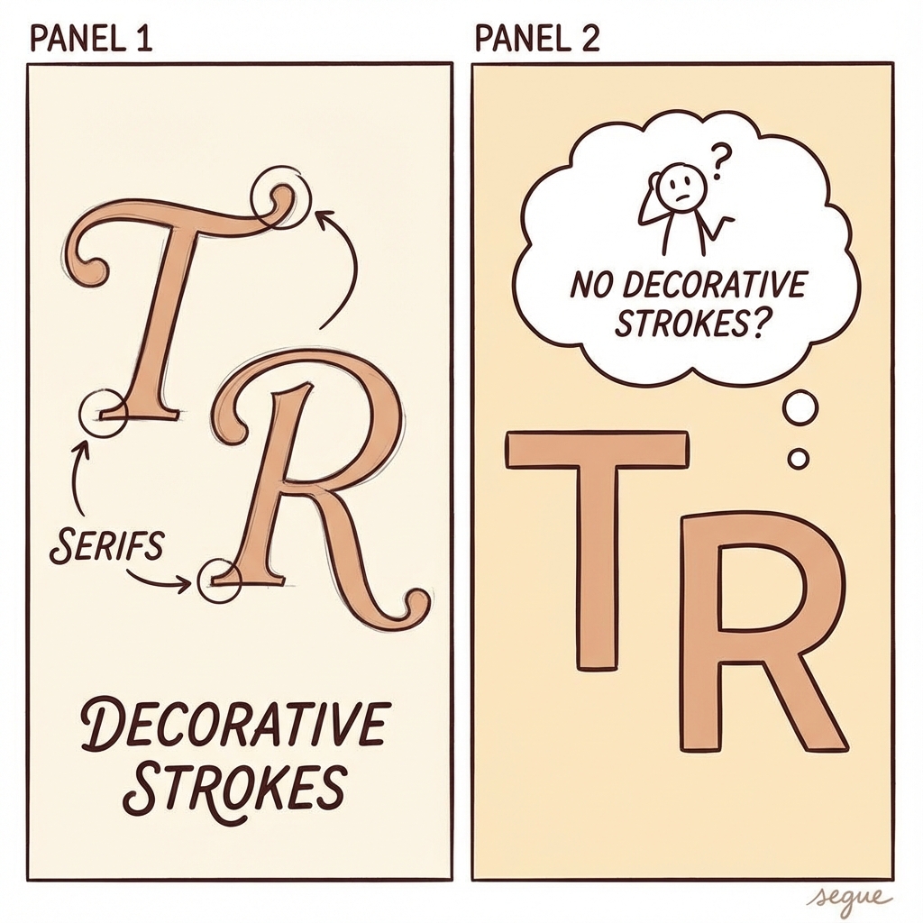
serif
/ˈserɪf/small decorative strokes at the ends of letters
“Serif fonts convey tradition and authority.”
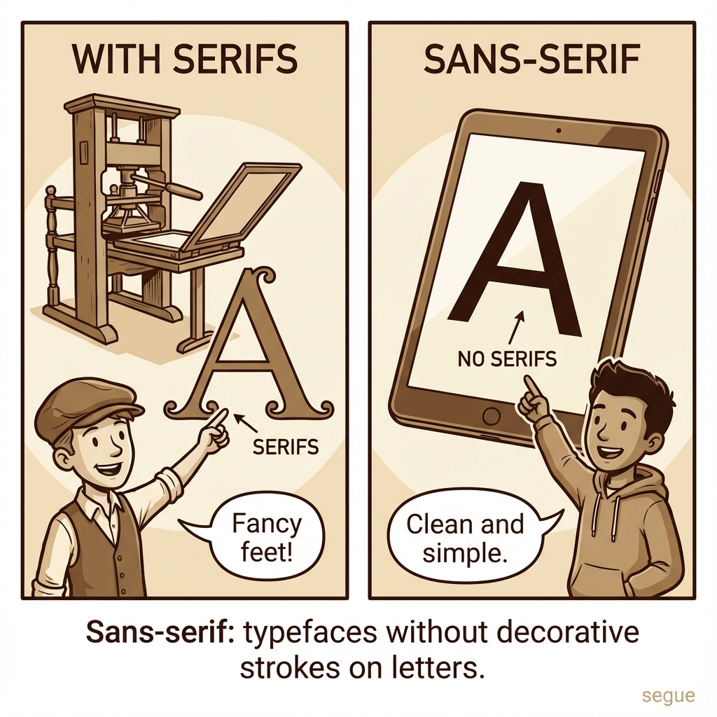
sans-serif
/ˌsænz ˈserɪf/typefaces without decorative strokes on letters
“Sans-serif fonts dominate digital interfaces.”
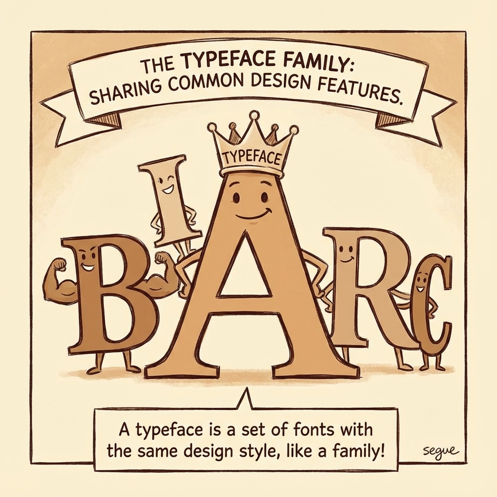
typeface
/ˈtaɪpˌfeɪs/a set of fonts sharing common design features
“Helvetica is one of the most ubiquitous typefaces.”
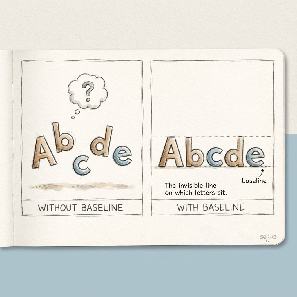
baseline
/ˈbeɪˌsɫaɪn/the invisible line on which letters sit
“Aligning to the baseline creates visual harmony.”
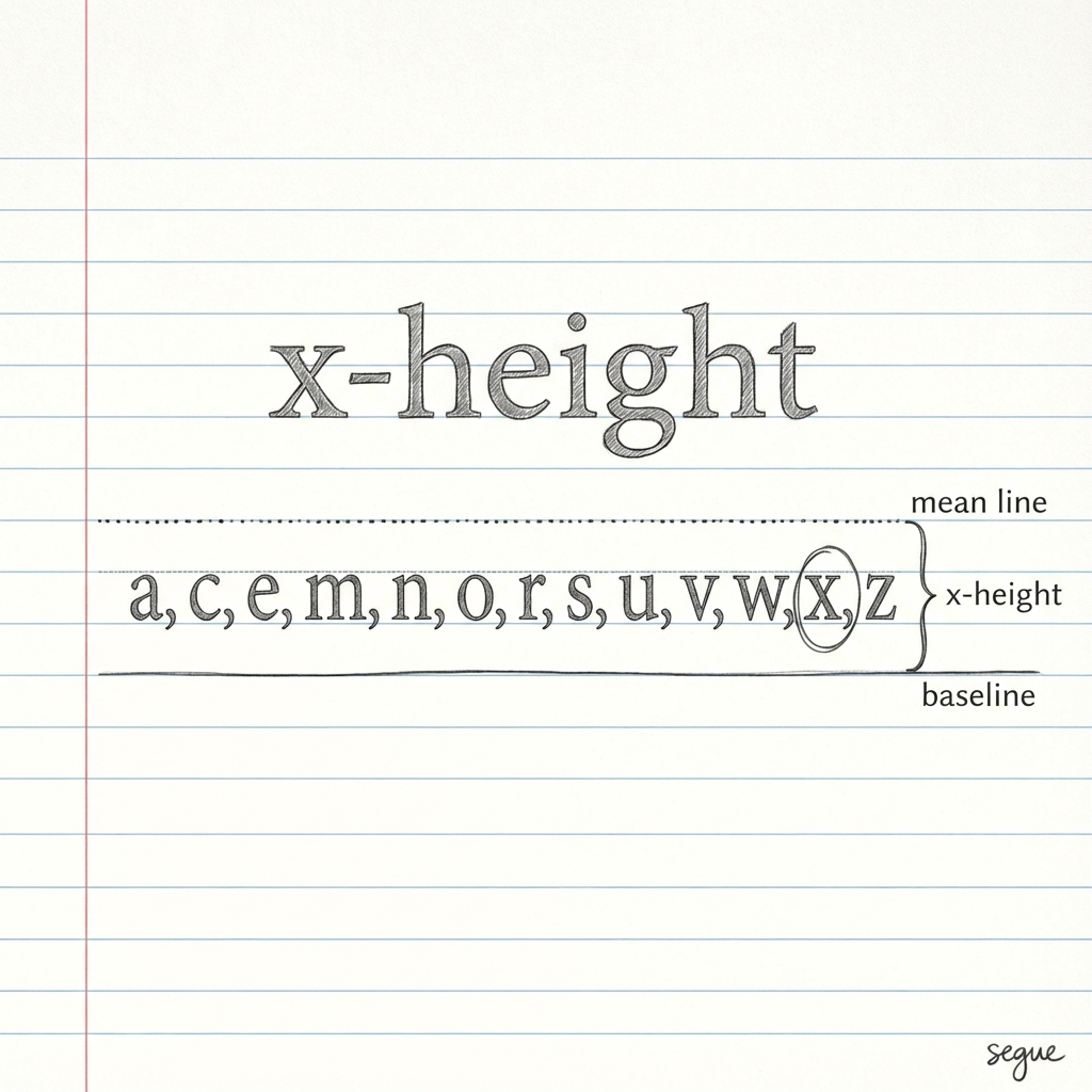
x-height
/ˈeks haɪt/the height of lowercase letters like 'x'
“A generous x-height improves legibility at small sizes.”
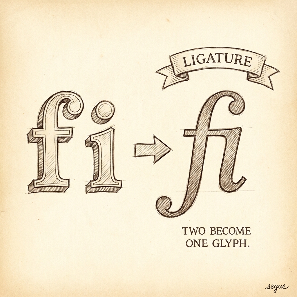
ligature
/ˈlɪɡətʃər/two or more letters combined into a single glyph
“The 'fi' ligature prevents awkward letter collision.”
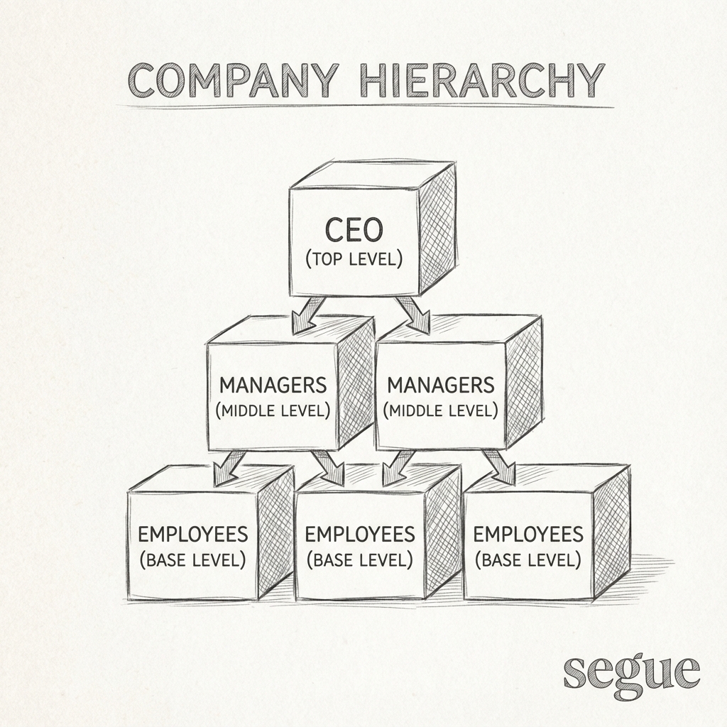
hierarchy
/ˈhaɪˌɹɑɹki/the visual organization of type by importance
“Typographic hierarchy guides readers through content.”
More from Design & UX
Explore other vocabulary categories in this collection.